Homeline Mortgages - Complete Brand Refresh
We had been working with Homeline for several years before they decided to re-brand. The company was moving offices so perfect timing for a refresh! The brief was to retain the eye-catching yellow that the client loved, and to keep some sort of house shape as the sub logo into the design.
The updated logo celebrated Homeline’s strapline of ‘home is where the heart is’ with the heart in the centre whilst the house outside protects and embraces.
Whilst Homeline are experts in their field they pride themselves on being friendly and approachable, we created a consistent language outlining this through the use of imagery and graphics across all touchpoints.

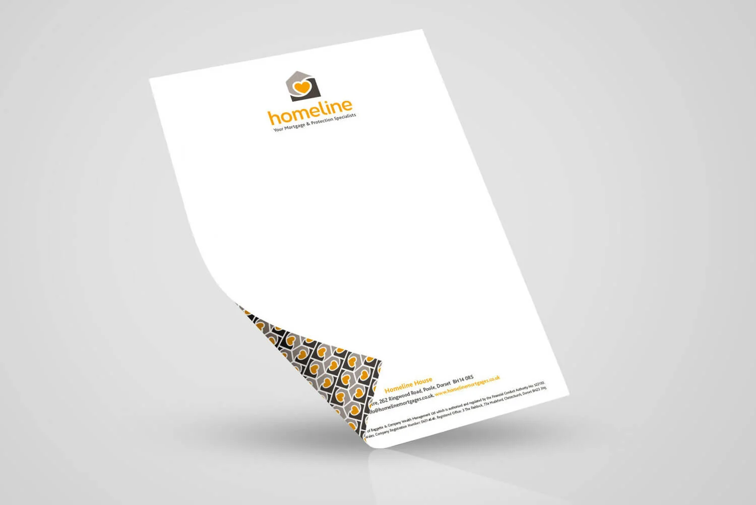
Double-sided letterhead with wallpaper back

Interior signage produced out of laser cut vinyl
The new refined identity sets Homeline apart from its competitors and can now be seen as a modern, high quality, friendly mortgage and protection service.
Scope of work so far includes a branded suite of stationery, exterior signage along with printed marketing assets and roller banners that Homeline can use at local events. We regularly design traditional print advertising to help voice the new brand within its market place and have designed a new web presence alongside Homeline’s programming team advising and ensuring consistency with the branding. Having a distinct visual language means marketing campaigns and communications ensure Homeline become a recognisable and trustworthy brand.

A5 postcard for brand awareness

A5 ‘New Home’ postcard

One of a suite of roller banners ready for exhibitions and shows

Website design guide on-brand and ready for external programmers to build
Website icon graphics